The next Lemmy version will add a donation dialog, which is shown once a year to every user, in order to increase the amount of donations for Lemmy development. You can see the current text in the screenshot above and in the translations repo. You can also checkout the frontend PR. Is there anything you would change about the text?
Edit: This is how the final design looks like:
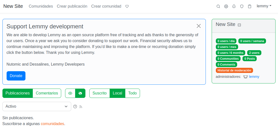
Should be more obvious that this is for the project and not the instance.
is the “hide permanently” button really necessary? I feel like a lot of users will click that without much thought, and a year sounds low frequency enough for me
Actually thats true. Gonna remove that button for now, we can still add it back later if there are too many complaints.
Just add a timeout you have to wait before pressing, say 10-30 seconds.
No that would be too annoying.
Consider Donating To Support Lemmy
We’re able to develop Lemmy as an open source platform free of tracking and ads thanks to the generosity of our users. Once a year we ask those who are able to consider donating to support the volunteers that develop and maintain this platform. Financial security allows us to continue current development projects and plan accordingly for long term projects. If you’d like to make a one-time or recurring donation simply click the button below. Thank you for using Lemmy.
👍
Here’s my two cent: changing color of donate button to green and hide button to orange would be better since primary color is green.
Orange is actually the primary color in the theme, although green (secondary color) is used much more.
would making the hide button grey work, or would that be not consistent with the theme?
I can do black, that does actually seem a bit better.
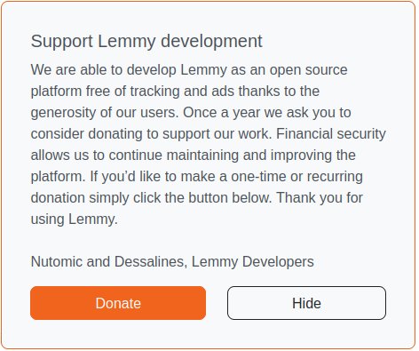
that looks really good!
Imho the best would be one that is customizable by the instance admins.
You mean to add donation links for the instance? That makes sense, but I fear that it would be too complicated for users. Admins already have many ways to put donation links eg in the sidebar and sticky posts, but for developers theres only a small button at the top which is easy to miss. And our donations have gone down a lot, now only 2400 Euro per month.
Well, I think a personalized message (maybe in the primary language of the instance) is more effective than some standard text thats everywhere.
I think most instance admins realize that there is also a need to support the devs, and a single place that advertises both and can get linked from the sidebar might also be more bring more donations to the devs.
The dialog can also be translated using weblate (although thats not currently setup for 0.19 backports).
And the dialog cant be linked from other places. In any case we can still make changes after this is released based on feedback.
I opened an issue regarding a donation dialog for instance admins, which seems closer to what you mean.
You could add a word or phrase to remind people that it’s being given away for free to anyone that wants to run it. That might get people to think about any benefit they are getting out of it, and how much they want to donate in response.
I’m not sure what is the best wording for that, but just be careful in case someone misunderstands and thinks it might become paid someday. I’ve seen that complaint in the past
For example, this could be misinterpreted:
and if you want to keep using it for free
You can also add a note about the frequency of the messages. Saying that you will only remind people once a year is nice to hear, and that way people won’t dismiss it thinking they will do it when they are reminded the next time
Thanks for the suggestions. I changed the first sentence to “Lemmy is an open source project developed by volunteers and provided for free”, and changed the hide button text:
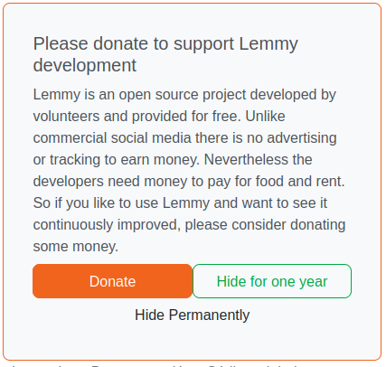
Edit: Also shortened the title so it fits in a single line:
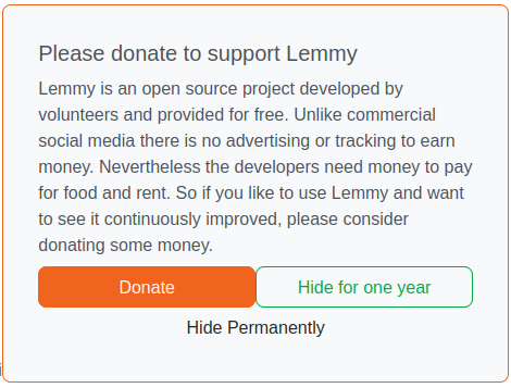
Good, I also think the “some money” part in the end can be removed. It’s obvious and at the same time makes it sound a bit more rough than it needs to be.
Youre right.
Nice, I like it :)
I think the buttons need a small padding between them, feels less weird on the design
Feels too wordy and impersonal. How about
Support Lemmy Development
Lemmy is developed by volunteers and provided for free. We do not track, advertise or charge you for profit. Nevertheless, our developers need money to pay their food and rent. If you like to use Lemmy and want to see it improved and updated, please support us with a donation
- Nutomic & Dessalines
Also I assume you’ll fix the button alignment, because it’s quite annoying
btw you can’t link to the image on github directly like that - the link expires after 5 minutes. I think https://github.com/user-attachments/assets/d6fddb38-0c71-4e79-81f6-0a359c41e7fc should work though.
Thanks, changed the link.
Edit: Nope that broke the thumbnail, uploaded it to Lemmy directly now.
I 99% of the time used reddit, and henceforth Lemmy via a mobile client (Boost at the moment) and am curious how you could target me.
There’s also the other frontends like Photon that I use on my PC (1% time…) that if I’m thinking right also wouldn’t show it?
Cheers for all your work, it’s much appreciated!
That is true. You might see it if you use the default web interface once in a while, or app devs could also implement this feature. Anyway its better than nothing.
From my POV not only „free of adds and tracking“ are important to underline. Also „free of political and commercial pressure“ is key, from my POV this is the most important, especially in the current political climate. I know this is not directly a reason why donations are needed, like the others are. But for someone to decide about a donation this is a very important reason to throw money in.
It seems difficult to explain these in such a short text. However I will make a similar post soon to improve the donation page on join-lemmy.org, maybe it could be included there as it has more space available.


